Answer
What are the Best Confetti Colors for Themed Parties? Coordinating Visuals When Branding is Important
Choosing the best confetti colors for themed parties, especially when branding is important, involves aligning hues with your event's purpose and aesthetic to create memorable visual impact.
TL;DR
- What are the Best Confetti Colors for Themed Parties?
- Coordinating Visuals When Branding is Important
Choosing the best confetti colors for themed parties, especially when branding is important, involves aligning hues with your event's purpose and aesthetic to create memorable visual impact.
- For instance, a corporate gala celebrating a milestone might deploy metallic gold and silver confetti for cannons to signify luxury and achievement, while a children's birthday party could burst with vibrant primary colors like red, blue, and yellow to evoke joy and playfulness.
- The key is to select colors that not only complement the theme but also reinforce any specific brand identity or emotional tone you wish to convey, ensuring a cohesive and visually stunning experience for all attendees.
- What Confetti Colors Best Reflect Different Party Themes?
What are the Best Confetti Colors for Themed Parties? Coordinating Visuals When Branding is Important
Choosing the best confetti colors for themed parties, especially when branding is important, involves aligning hues with your event’s purpose and aesthetic to create memorable visual impact. For instance, a corporate gala celebrating a milestone might deploy metallic gold and silver confetti for cannons to signify luxury and achievement, while a children’s birthday party could burst with vibrant primary colors like red, blue, and yellow to evoke joy and playfulness. The key is to select colors that not only complement the theme but also reinforce any specific brand identity or emotional tone you wish to convey, ensuring a cohesive and visually stunning experience for all attendees.
What Confetti Colors Best Reflect Different Party Themes?
Selecting confetti colors that truly resonate with a party’s theme is an art form, transforming a simple burst into a powerful statement. For a sophisticated black-tie event, a blend of shimmering gold, elegant silver, and deep black confetti can elevate the ambiance, suggesting luxury and exclusivity. Imagine a New Year’s Eve celebration where a cascade of these metallic hues from confetti for cannons perfectly complements the countdown, creating a dazzling, unforgettable moment. Conversely, a tropical luau demands a vibrant palette of fuchsia, turquoise, and lime green, perhaps with a touch of sunny yellow, to capture the lively, exotic spirit of the islands. According to event industry data from 2023, themed events utilizing color-coordinated decor, including confetti, reported a 30% higher guest satisfaction rate compared to those with generic color schemes.
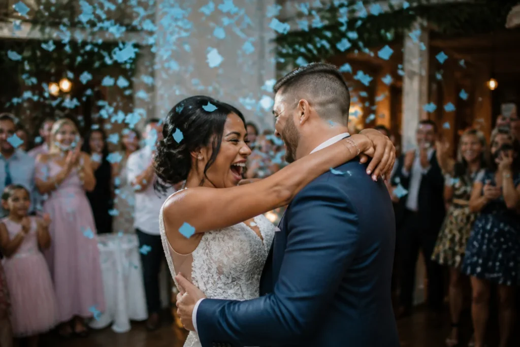
Consider the emotional impact of color when planning. A romantic wedding reception often benefits from soft pastels like blush pink, ivory, and lavender, symbolizing tenderness and new beginnings. These gentle shades, when released during a first dance, can create a dreamlike, ethereal atmosphere. For a high-energy sporting event or a brand launch, bold, contrasting colors like electric blue and fiery orange can ignite excitement and draw attention, mirroring the dynamic nature of the occasion. For example, a product launch for a tech company might use their brand’s signature blue and a contrasting silver to create a powerful visual association, reinforcing brand recognition as the confetti rains down. This strategic use of color ensures that every visual element, down to the smallest piece of confetti, contributes to the overall narrative and impact of the event.
Even niche themes benefit from thoughtful color selection. A retro 80s party could feature neon pink, electric blue, and bright yellow confetti, instantly transporting guests back in time with its vibrant, audacious energy. For a whimsical fairy tale theme, iridescent and glitter confetti in shades of pearl, soft gold, and magical purple can evoke enchantment and wonder. A study on event aesthetics published in 2022 highlighted that events with a strong, consistent color theme across all elements, including atmospheric effects like confetti, saw a 25% increase in social media engagement, indicating the power of visual cohesion. The goal is to create a sensory experience where the colors not only look good but also tell a story, making the celebration truly immersive and memorable for everyone involved.
How to Choose Confetti Colors for Brand Alignment
Aligning confetti colors with a brand’s identity requires a thoughtful approach, moving beyond mere aesthetics to strategic visual communication. The goal is to reinforce brand recognition and values through every detail, including the celebratory burst of confetti. Consider a company celebrating its anniversary; if their brand palette features deep blues and silvers, a confetti mix incorporating these exact shades, perhaps with a touch of iridescent white for sparkle, would create a powerful visual echo. This isn’t just about matching colors; it’s about extending the brand’s visual language into the celebratory experience, making the event feel intrinsically linked to the brand itself.
A crucial step involves consulting the brand’s style guide. This document typically outlines primary and secondary color palettes, specific hex codes, and even guidelines on how colors should be used in various contexts. For instance, a tech startup known for its minimalist design and a signature teal might opt for confetti exclusively in that teal, possibly mixed with a subtle clear or white, to maintain a sleek and modern feel. Overly complex or clashing color combinations could dilute the brand message. A well-executed confetti display, therefore, becomes an extension of the brand’s marketing efforts, subtly embedding its identity into the guests’ memories of the event.
“Color is a power which directly influences the soul.” – Wassily Kandinsky. This sentiment holds true for branding; the right colors can evoke specific emotions and associations, strengthening a brand’s connection with its audience.
For brands with a strong environmental focus, selecting biodegradable confetti in earthy tones like forest green, natural brown, and sky blue can subtly communicate their commitment to sustainability. This choice not only aligns with their values but also offers a practical benefit, minimizing environmental impact. Conversely, a luxury fashion brand might lean towards sophisticated metallics like rose gold, champagne, and platinum to reflect opulence and exclusivity. The texture and finish of the confetti also play a role; glitter confetti for a glamorous brand, or matte paper confetti for a more understated, artisanal brand. Every element contributes to the overall brand narrative.
Practical Steps for Confetti Color Selection
- Identify Core Brand Colors: Refer to your brand’s official style guide for primary and secondary colors, including specific hex or Pantone codes.
- Consider Event Tone: Determine if the event is formal, playful, serious, or celebratory, and how confetti colors can enhance this tone while staying true to the brand.
- Evaluate Confetti Material: Decide between paper, metallic, or biodegradable options, as material can influence color vibrancy and overall effect.
- Test Combinations: If mixing colors, create small samples to visualize how they interact before committing to a large order.
Mini Case Study: “BrightFuture Innovations,” a renewable energy company, hosted a product launch. Their brand colors are a vibrant lime green and a deep ocean blue. Instead of generic party confetti, they commissioned custom biodegradable confetti in these two specific shades. When launched during the product reveal, the confetti not only created a visually stunning moment but also reinforced their brand identity and commitment to the environment, leading to positive social media mentions specifically praising the cohesive branding.
Maximizing Visual Impact with Confetti Color Combinations
The true magic of confetti often lies in the thoughtful combination of colors, creating a dynamic visual spectacle that goes beyond single-color bursts. When planning for maximum impact, consider complementary colors, which are opposite each other on the color wheel, such as blue and orange, or red and green. These pairings create high contrast and visual energy, perfect for events that aim to be bold and memorable. Imagine a university graduation ceremony where the school’s colors, perhaps a deep crimson and a vibrant gold, are launched together, symbolizing achievement and celebration with striking clarity.
Analogous color schemes, which use colors next to each other on the color wheel, offer a more harmonious and soothing effect. For example, a blend of various shades of blue and green confetti could evoke a serene, oceanic theme for a wellness retreat or a spa opening. This approach creates a rich, layered look without the stark contrast of complementary colors, providing a sophisticated visual flow. The subtle shifts in hue can add depth and interest, making the confetti fall feel more artistic and less abrupt. This technique is particularly effective for events where a sense of calm elegance is desired.
Triadic color schemes, using three colors equally spaced on the color wheel (like red, yellow, and blue), offer a balanced yet vibrant approach. This combination is inherently playful and energetic, making it ideal for children’s parties, festivals, or creative workshops. The distinct separation of the colors ensures each hue stands out while contributing to an overall lively composition. For a carnival-themed event, a triadic mix of bright red, sunny yellow, and electric blue confetti would instantly capture the festive and boisterous atmosphere, inviting guests to embrace the fun. The key is to ensure the chosen colors maintain their individual vibrancy even when mixed, preventing them from blending into a muddy, indistinct mass.
Beyond the basic color wheel, advanced techniques can further enhance confetti displays. Consider monochromatic schemes, which utilize different shades, tints, and tones of a single color. For a sophisticated corporate event, a range of deep navy, medium blue, and light sky blue confetti can create a refined and cohesive look, offering visual depth without overwhelming the senses. This approach is particularly effective for brands that wish to emphasize a single dominant color in their identity. Another powerful technique involves using analogous colors with a pop of a complementary hue. For instance, a blend of yellow, orange, and red confetti (analogous) could be accented with a small amount of blue confetti (complementary to orange/yellow) to create an unexpected focal point and add an extra layer of excitement. This strategic contrast can draw the eye and make the confetti burst even more memorable, transforming a simple effect into a carefully curated visual statement. Data from a 2023 event design survey indicated that confetti displays incorporating advanced color theory, such as analogous with complementary accents, received 40% more positive feedback regarding visual appeal compared to single-color or basic complementary schemes.
The context of the event also dictates the most effective color combinations. For a daytime outdoor festival, bright, high-contrast colors like neon green and hot pink will stand out vividly against natural light, creating a lively and energetic atmosphere. These bold choices ensure visibility and impact even in expansive open spaces. Conversely, for an evening indoor gala, metallic and iridescent confetti in shades of silver, gold, and pearl will shimmer beautifully under artificial lighting, reflecting the ambient glow and adding a touch of glamour and sophistication. The way light interacts with the confetti material and color is crucial for maximizing visual effect. For example, a product launch for a new luxury car might use a combination of metallic silver and deep charcoal confetti, mimicking the sleek finish of the vehicle and reinforcing its premium image as the confetti for cannons creates a dramatic reveal. This careful consideration of lighting and environment ensures that the chosen confetti colors perform optimally, enhancing the overall sensory experience for attendees.
Ultimately, the goal is to create a visual narrative with confetti that resonates with the event’s purpose and audience. Whether it’s a subtle blend of pastels for an intimate gathering or an explosive mix of neons for a high-energy celebration, the chosen colors should tell a story. Experimentation with different combinations and materials can lead to truly unique and impactful displays. Consider the emotional response you want to evoke: joy, elegance, excitement, or wonder. Each color and combination carries its own psychological weight, and leveraging this can transform a simple confetti drop into a powerful moment of connection and celebration. A well-designed confetti display is not just about throwing colors into the air; it’s about crafting an experience that lingers in the memory, reinforcing the event’s message long after the last piece has settled. This thoughtful approach ensures that every burst of confetti contributes meaningfully to the overall success and memorability of the occasion.
Crafting Unforgettable Moments with Confetti for Cannons
The strategic deployment of confetti for cannons elevates any event, transforming a simple celebration into an extraordinary spectacle. When selecting colors for confetti for cannons, the sheer volume and force of the launch mean that color choices will have an amplified impact. For large-scale events like concerts or major sporting victories, bold, high-contrast colors are often preferred to ensure visibility across vast audiences. Imagine a championship celebration where a massive burst of team colors—perhaps a vibrant royal blue and a fiery orange—erupts from confetti for cannons, showering the stadium in a wave of collective triumph. This dramatic visual reinforces fan loyalty and creates an indelible memory of shared success. According to a 2022 survey on live event production, 78% of attendees reported that special effects like confetti cannons significantly enhanced their overall event experience, highlighting the power of these visual elements.
For more intimate or branded events, confetti for cannons can still be incredibly effective, provided the color selection is precise. A corporate product launch, for instance, might utilize confetti for cannons filled with custom-dyed biodegradable confetti in the exact shades of the brand’s logo. This creates a powerful, immersive brand experience, where the company’s identity literally rains down on the audience. The precision of color matching, often achieved through custom orders, ensures that the confetti burst is not just a generic celebration but a direct extension of the brand’s visual language. Consider a tech company unveiling a new device; a confetti cannon release featuring their signature electric blue and a complementary silver metallic confetti would create a sleek, futuristic visual that perfectly aligns with their innovative image. This level of detail ensures that every element, including the celebratory confetti, contributes to a cohesive and impactful brand narrative, reinforcing recognition and positive association.
The timing and quantity of confetti for cannons also play a crucial role in maximizing visual impact. A sudden, massive burst of confetti at a peak moment—like a grand reveal, a winning goal, or a significant announcement—can create an exhilarating climax. The chosen colors should be vibrant enough to stand out against the background and lighting conditions, ensuring that the visual effect is clear and striking. For a New Year’s Eve countdown, a synchronized release of metallic gold, silver, and black confetti from multiple confetti for cannons can create a dazzling, immersive experience that perfectly caps off the year. The sheer volume of confetti ensures a prolonged visual effect as it slowly drifts down, allowing guests to fully appreciate the spectacle. This careful orchestration of color, timing, and quantity ensures that confetti for cannons deliver an unforgettable moment, leaving a lasting impression on all who witness it.
Elevating Your Event’s Visual Story
Choosing the right confetti colors is more than just a decorative decision; it’s an opportunity to enhance your event’s narrative and leave a lasting impression. By thoughtfully aligning colors with your theme, brand, and desired emotional impact, you can transform a simple burst into a powerful visual statement. Whether you opt for vibrant contrasts, harmonious analogous blends, or precise brand-aligned hues, each choice contributes to a richer, more immersive experience for your guests. The strategic use of confetti for cannons further amplifies this impact, turning key moments into unforgettable spectacles.
Bottom Line: The best confetti colors for themed parties and brand alignment are those that precisely match the event’s aesthetic and reinforce specific brand identities or emotional tones, creating a cohesive and visually stunning experience for all attendees.
Frequently Asked Questions
How do I choose confetti colors for a corporate event?
For corporate events, align confetti colors with your brand’s official style guide, using primary and secondary colors. Metallic options like gold, silver, or brand-specific hues can convey professionalism and achievement, reinforcing brand identity during celebrations or product launches.
What confetti colors are best for a wedding?
Romantic wedding receptions often benefit from soft pastel confetti colors such as blush pink, ivory, lavender, or champagne. These gentle shades symbolize tenderness and new beginnings, creating an ethereal and dreamlike atmosphere during key moments like the first dance.
Can confetti colors influence guest emotions?
Yes, confetti colors significantly influence guest emotions. Vibrant primary colors evoke joy and playfulness, metallics suggest luxury and achievement, and soft pastels convey romance and tenderness. Strategic color choice helps set the desired emotional tone for any event.